To quickly recap our proposal for this project, we wanted to delve into the often-uncomfortable topic of gun-related violence. By exploring the data from a purely statistical lens, we wanted to see if we could gain any insights into this sensitive issue. We approached the project with the intention of answering the following questions:
-
Demographics - which gender or age group is more susceptible to gun violence?
- How are children and teenagers affected?
- Which age group is more likely to commit violence?
- Which gender is more likely to commit violence?
- What is the mortality rate of shooting-related incidents?
-
Geographical trends - Where is the violence taking place?
- Is it a national or local issue?
- Why do certain socio-economic regions experience a spike in violence?
- Which counties, cities, or states have the most incidents?
- Are there correlations between certain times of the year?
-
Ethical questions - Is the public's perception of shootings accurate?
- How is an incident categorized?
- Is the perception of a mass shooting consistent to how it's defined by different government agencies?
- Are there discrepancies between the definitions and the data?
- Can we find a link between an area's violence rate with gun laws?
We kicked off the project by looking for viable and readily available data sources. We knew that there were several open to the public ranging from official government agencies such as the FBI to various non-profit organizations that kept track of gun-related incidents.
The Gun Violence Archive (GVA) was the first to come to mind. Established in 2013, they have been used as a reputable source of incident data by numerous outlets through the years. Through their website, we explored their massive database, and even found some maps and graphs that we thought could serve as inspiration for some of our data visualizations. Eventually, we discovered a way to export the data through a reporting feature, and it was conveniently already organized into different categories such as years or incident attributes.
However, after quickly going through the exported data, we realized that it did not have as much information about each incident compared to what's found on the incident's webpage (example incident). For some reason, the csv exports were limited to the following columns: Incident ID, Incident Date, State, City Or County, Address, # Killed, # Injured, and Operations. While this may be enough to build a couple of visualizations out of, we had already envisioned utilizing the rest of the more interesting data, such as shooting attributes, found in the incident pages for more insightful visuals. Also, Cesium, the mapping tool we're using, required specific longitude and latitude coordinates to plot incident locations. More importantly, answers to our initial questions were going to need more extensive data, hence we needed to find a way to extract the information from the page.
Initially, we attempted web scraping and even wrote a python script that would crawl through every single incident page based on a date range and extract specific fields from it. We quickly found out that the GVA had anti-scraping tools in place that proved to be too troublesome for us to circumvent. It was at this point that we looked elsewhere for additional sources.
Finally, while going through the Awesome Public Datasets found in the class' resources page, we stumbled upon a GitHub repository containing fleshed out GVA data. It contained most of the additional attributes we were looking for, and funny enough, was compiled together using web scraping. The data set was from the years 2013-2018. The final range of years that we used was limited to 2014-2017. We ended up removing 2013 and 2018 because they were incomplete. 2013 had gaps in the records while 2018 was only up to March. Moreover, while not the newest of data, we thought it was still recent enough to draw relevant conclusions from. It had about 220,000 records, 20 relevant columns, and the unformatted csv file was over 147 MB.
Data sets weren't the only thing we were searching for at this time. To provide more context regarding incident types, we also wanted to find out how different organizations define mass shootings. Below are some of reputable sources we found alongside their respective definitions of a mass shooting:
- GVA - 4 or more injured or killed (not including the shooter)
-
Mass Shooting Tracker - 4 or more injured or shot (including shooter)
- Used by MSNBC & CNN
-
Mother Jones - 3 or more must be killed (not including the shooter)
- Doesn't include gang violence or armed robbery
- Congress - murder of 3 or more people (not including shooter)
-
FBI - 4 or more people killed (not including shooter)
- The FBI does not have a definition of Mass Shooting. They have a definition of Mass Murder which is four or more killed. It includes gun violence, bombings or any other incident where four or more are killed. Mass Murder would statistically be a subset of Mass Shooting.
- Everytown Research - 4 or more injured or killed (not including shooter)
We used a variety of tools throughout the process. Some of them we knew ahead of time we were going to use, and some we found and added to the toolbox along the way. Below is the list of the tools we leveraged for this project.
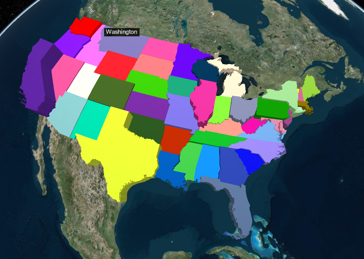
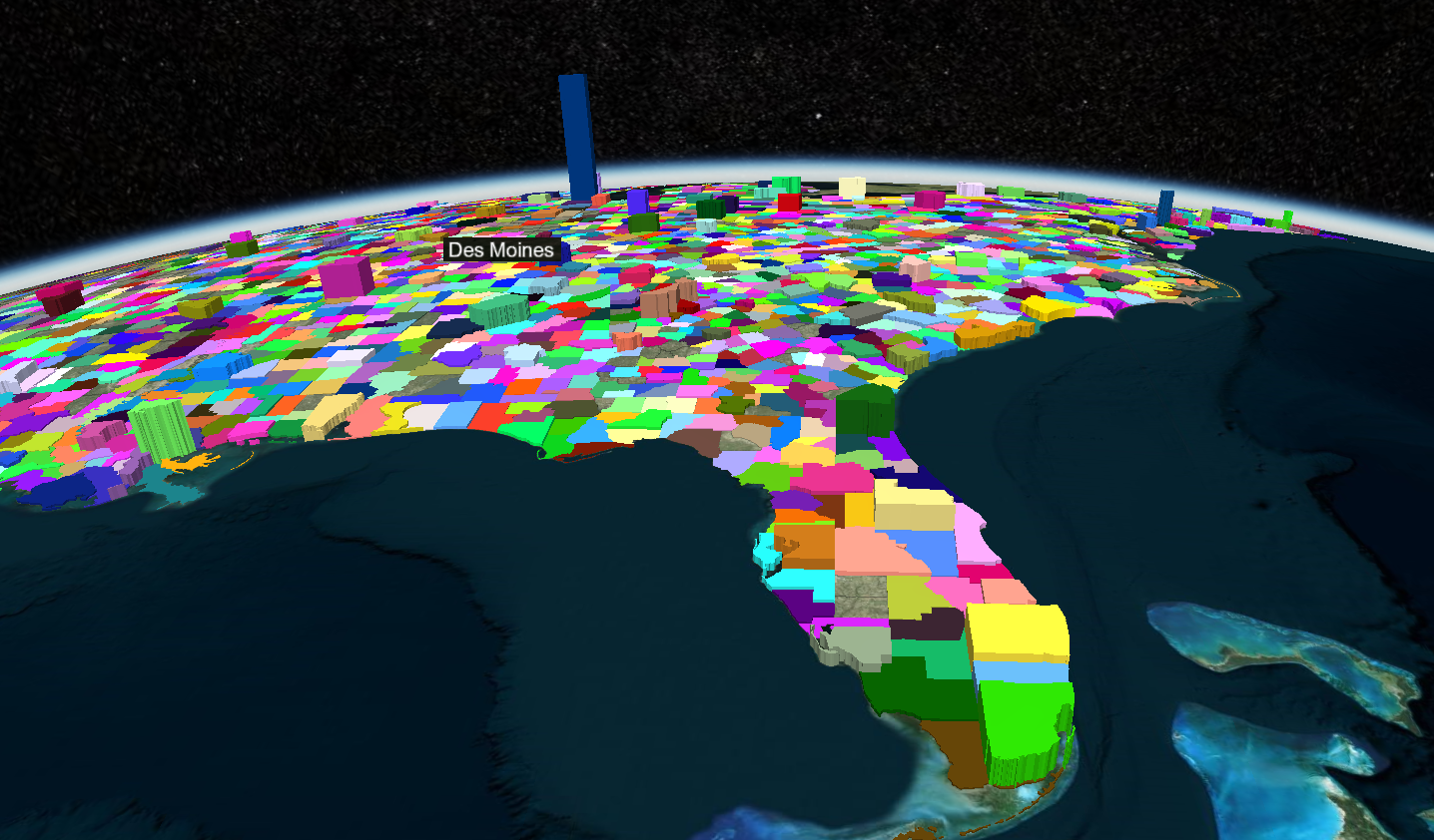
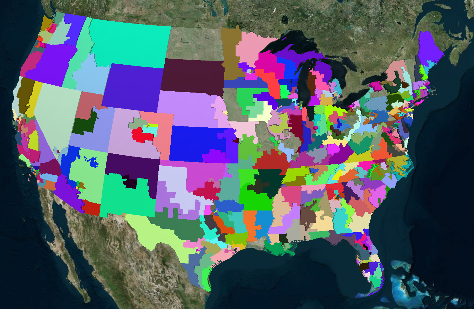
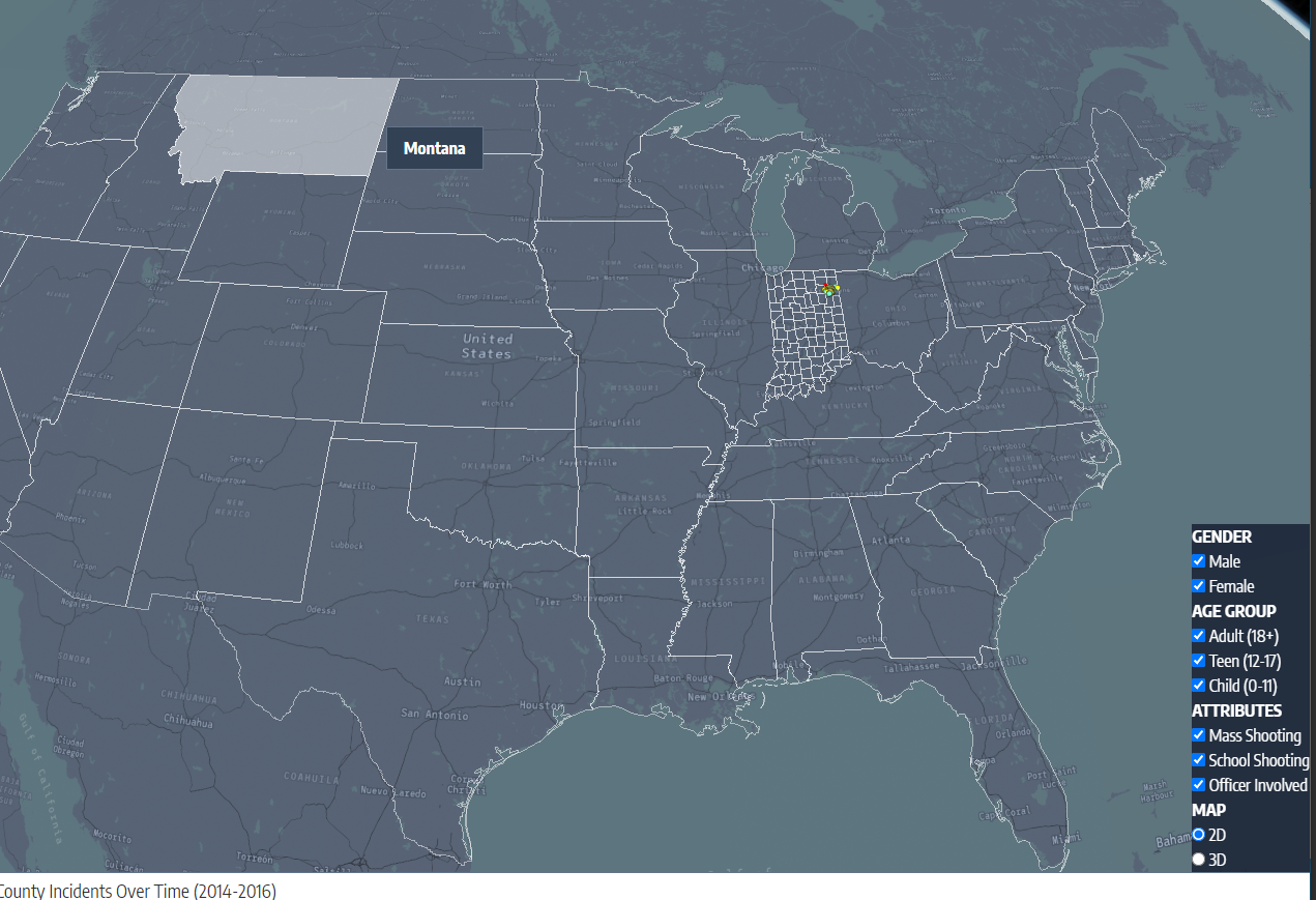
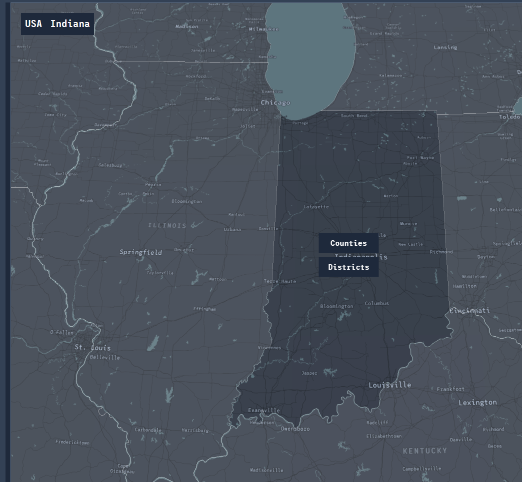
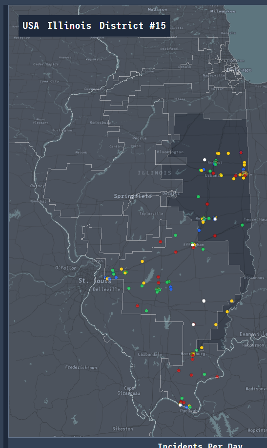
The idea we had was for the incidents to be plotted on a 3D interactive map of the entire United States. Cesium is an open platform used for 3D geospatial visualizations and fits the bill perfectly for what we envisioned.
The GVA data we had, while extensive, was also problematic. We will expand on the process of cleaning up the data later, but at this point, we decided to rely strictly on the latitude and longitude information instead of the accompanying incident address data because it was wildly inconsistent and inaccurate at times. For some reason, the city and county information were merged into one column. The issue was that sometimes it omitted either city or county, or both completely, hence making it difficult to plot the incident on the map. This is where Google's Geocoding API comes in. It provided us with a means of standardizing our location data provided that we have the incidents' coordinates. Our plan was to reverse geocode the latitude/longitude coordinates to gain a more accurate and complete description of the positional data.
As with most of Google's web services, the API was subject to a standard “pay-as-you-go" pricing model that allotted a free $200 worth of requests monthly. We also leveraged a first-time user bonus of $300 giving us $500 worth of API requests for April. To cover the roughly 220,000 rows of data, we planned to spread the requests over a period of two months using two separate accounts.
We then wrote a python script that would send out API requests containing coordinate data in a set interval allowing us to avoid hitting Google's hourly quotas. We tested this first using a smaller data set. For the live run, we decided to split the requests into three groups of 80,000. Each split took upwards of three to four hours to run its full course netting us a total script runtime of about 12 hours for roughly 220,000 rows. Once completed, the script parsed the results into a localized csv file that would then be converted into a JSON file. The final file sizes were 55.2MB and 88MB respectively.
Next on our list of tools is Highcharts. We knew that supplementary visualizations were going to be needed to gain additional insights into our gun violence data. While we contemplated using D3 for this project, we also looked at other charting libraries out there and came across Highcharts. It's a free JS-based library that's packed with features with great documentation and examples. Not only was it easy to use, but it also provided more avenues for customization than we initially expected.
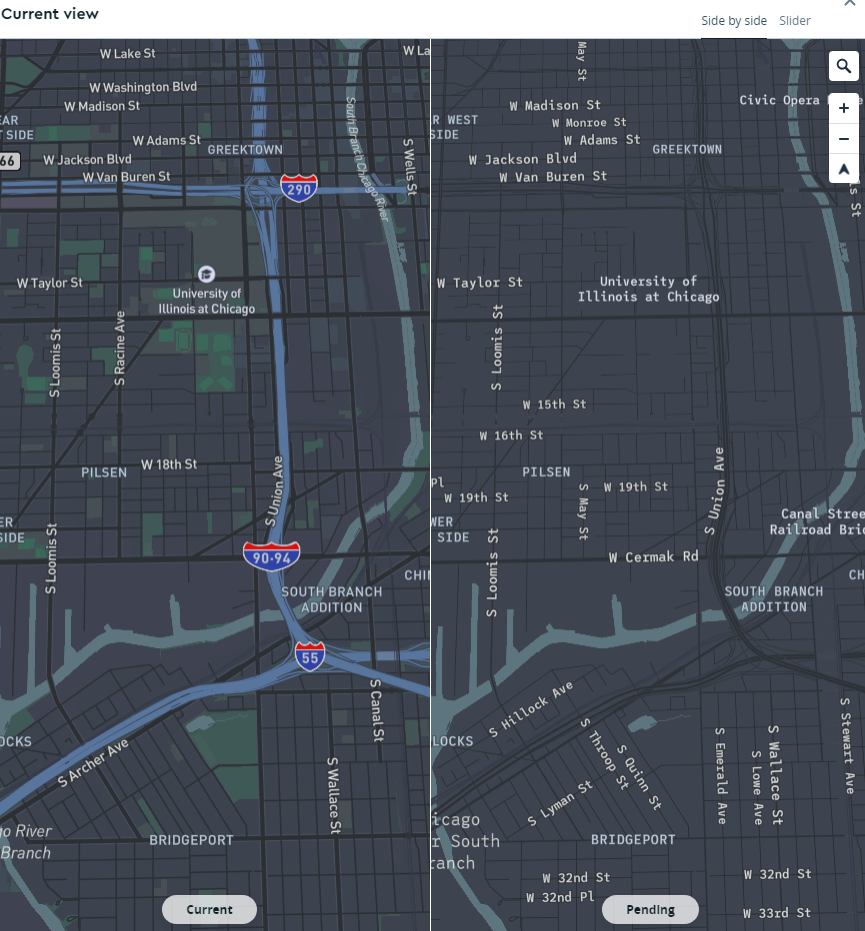
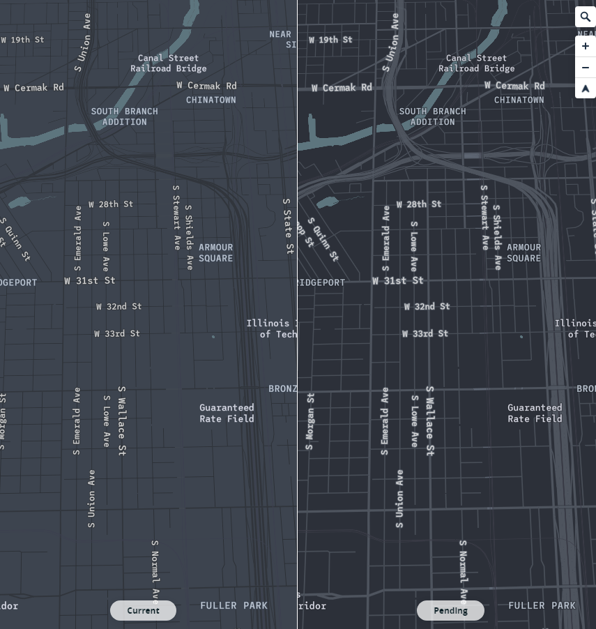
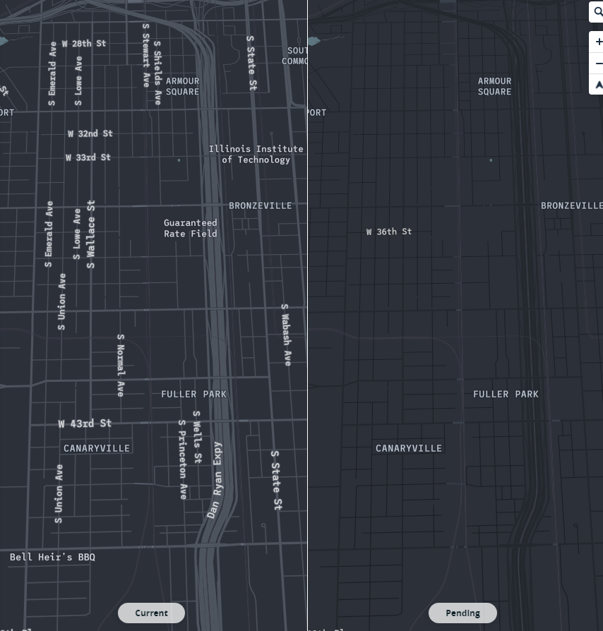
Later in the project, we realized that Cesium's default style and map layers needed an updated modern look. Once again, we turned to the world of free APIs to look for one that integrated seamlessly with Cesium. We came across Mapbox, which allowed for complete customization of map layers from a map's geographical features all the way down to door signs found in a city block. Needless to say, it provided us with complete control over how the map layer was going to look and feel on the page.
During the data trimming and reverse geocoding process, we discovered a number of issues with the dataset. Surprisingly, there were inconsistencies with the location fields, mostly at the county level. We had initially assumed that every city would fall under a county, and that's just how the hierarchical standard is across all the states nationally. However, this doesn't seem to be the case as we found many records that were missing a “county” value. When an incident doesn't have a county associated with it, it could be because it took place within city borders that's technically not part of any county. There were also times where county names would be the same as the township or city it was a part of. We learned from the data that some assumptions we've had for a long time were completely wrong.
Below are additional notable inconsistencies, surprises, and just odd things that we discovered about the location data found in our data set:
-
Lack of hierarchy and naming standards for city and county:
- Alaska has boroughs/census area instead of counties
- Louisiana has parishes instead of counties
- Some states had cities that were their own “county” and were then surrounded by a different county sharing the same name
- Roughly 30,000 records used either a single semi-colon or colon as delimiters instead of the double pipes (||) that were used for the rest of the data, adding to the difficulty of mapping through the data.
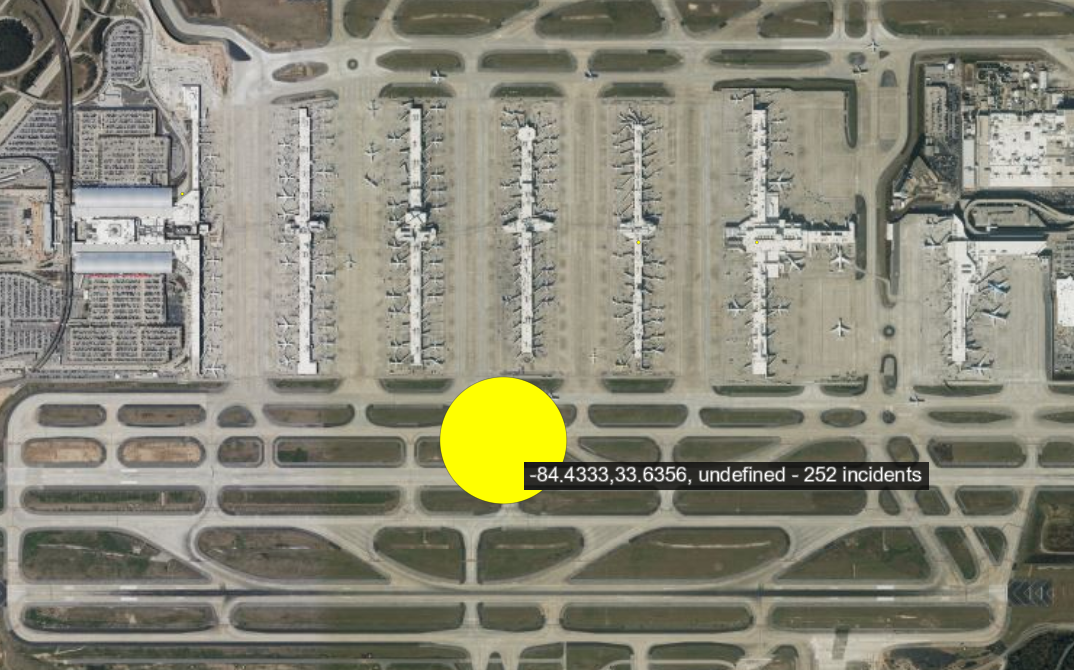
- The Atlanta area had oddities such as 250 incidents sharing the same coordinates, and it's at an airport. Looking into the incidents, they didn't seem to be airport-related incidents, and could probably be attributed to data entry errors.
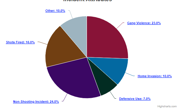
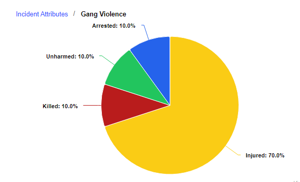
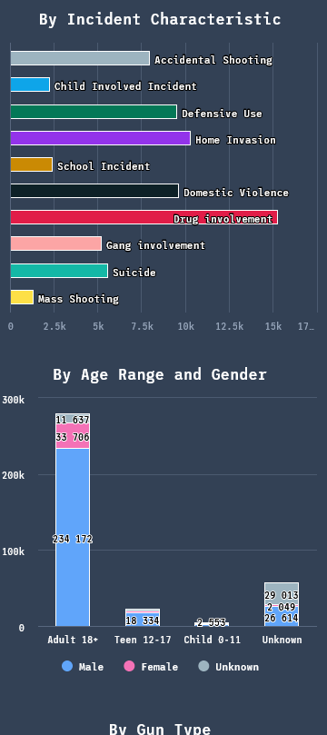
Each incident had an attributes column. This attributes column provided a description that gave us an idea what type of incident it was using a list of semi-standardized attributes. We knew that this column could be the key in uncovering some of the best insights about gun violence in the United States. The incidents could have multiple attributes as they were not mutually exclusive. The column data was vast, and upon taking a closer look, 110 unique values were found. Granted, some of the values were larger categories that had sub-categories (e.g. Home Invasion and Home Invasion - Resident injured).
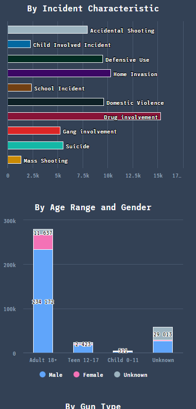
While it was important to provide as much detail for every incident as possible, it was clear that some consolidation was required to create effective visualizations to draw conclusions from and show on the page. We do want to note that the incidents found on the interactive map did not compromise on this, and they do display the full list of shooting attributes when clicked. The attributes listed below either had the most frequency of occurrence or were noteworthy:
- Accidental Shooting
- Child Involved Incident
- Defensive Use
- Home Invasion
- School Incident
- Domestic Violence
- Drug Involvement
- Gang Involvement
- Suicide
- Mass Shooting
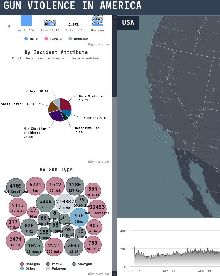
Later, a Highcharts bar graph was used to display these attributes.
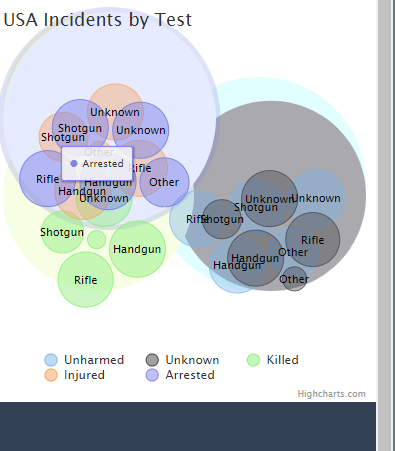
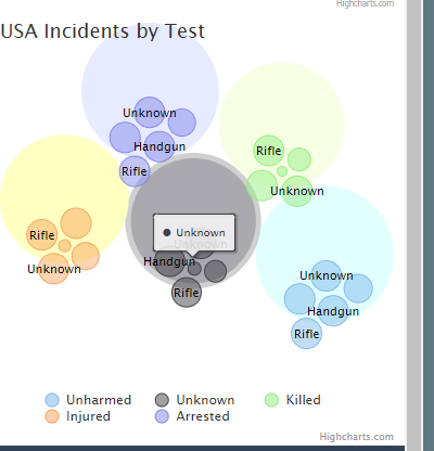
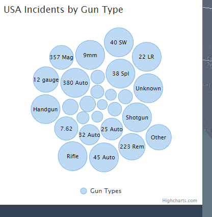
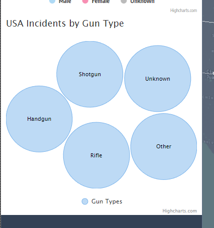
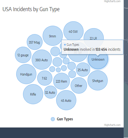
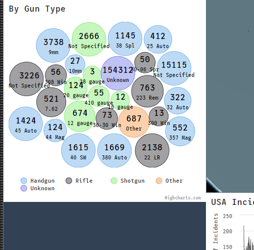
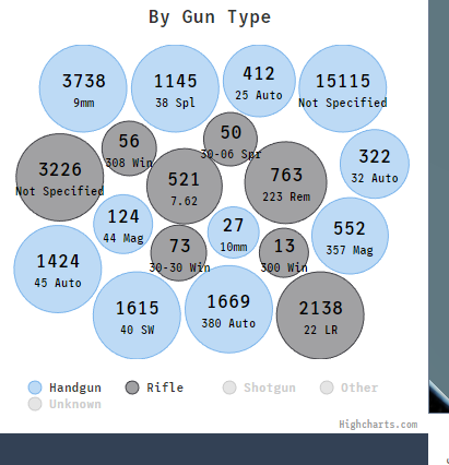
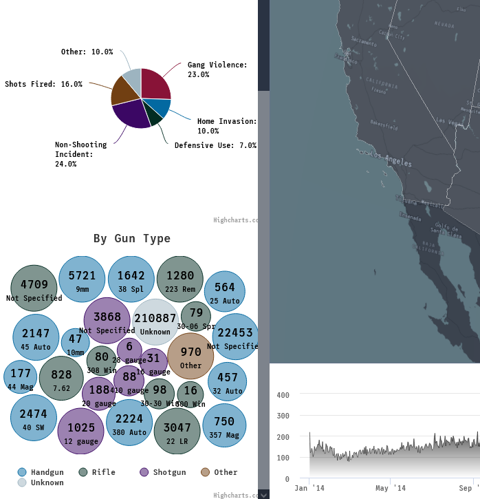
Though not as fleshed out as we'd like it to be, the gun type and caliber used were interesting columns that we wanted to explore. There were a lot of missing values for this column, but it still required consolidating as the entries did not seem as standardized as the attributes column. Often times, the caliber of the gun would be used as its gun type vice versa. Below were the main gun types that we then further broke down into calibers in a bubble chart later:
- Handgun
- Rifle
- Shotgun
- Other
- Unknown
Lastly, we wanted to make a note about unknown values. Outside of the location data, every single column had a large percentage of unknowns which can be seen as a limitation of the data set. However, we realize that this is the nature of gun-related incidents, especially whenever crime is involved. Naturally, those involved are going to try their best to hide as much information about themselves as possible, thus making data collection harder.
Moreover, the large numbers of unknowns could also be an indicator that there is a larger problem incident tracking and data entry, but that's more speculatory on our end.
As mentioned before, we wanted to generate additional supplementary charts that can aid us in discovering more insights from the data. Whether it was to confirm previously thought assumptions or to recognize undiscovered trends, the charts' goals were to answer the questions we had defined at the beginning and simultaneously make the data as easy for the user to understand as possible.
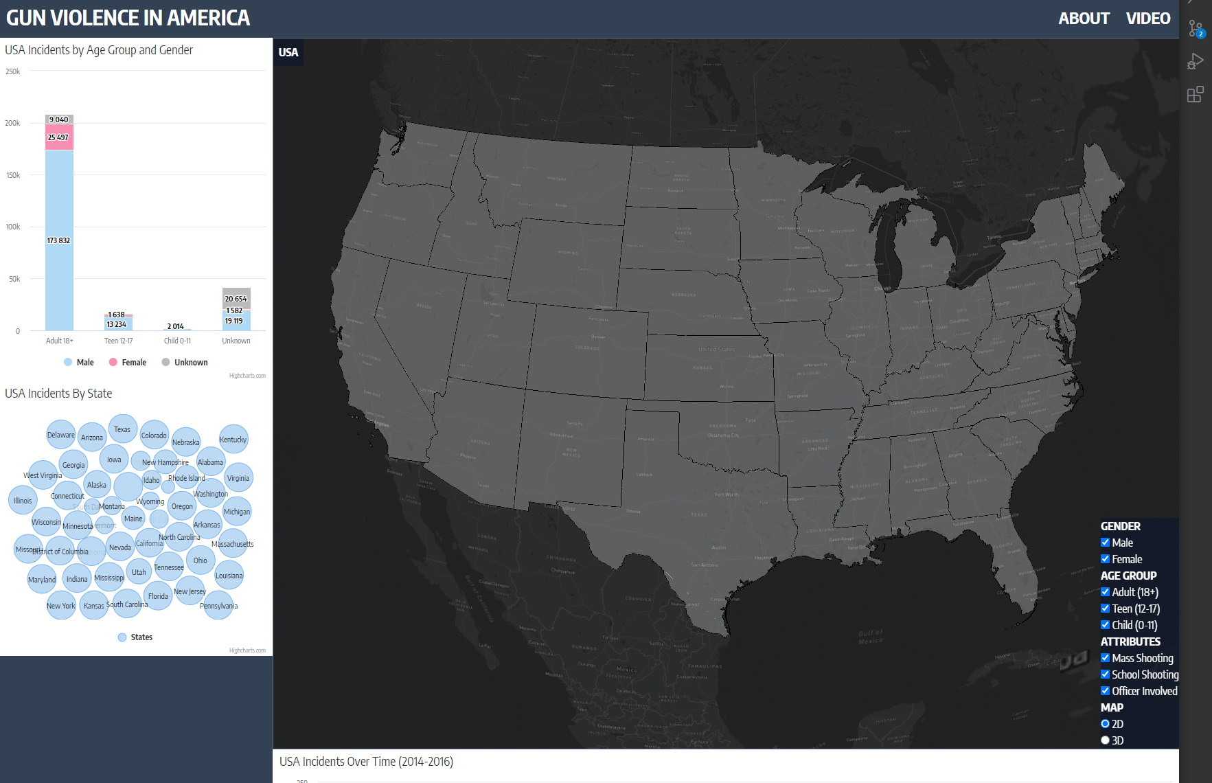
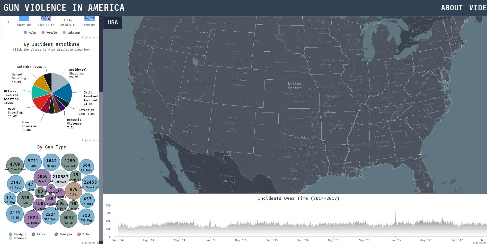
Initially, we liked the idea of having five total charts including the interactive map. The supplementary charts would be updated dynamically and will reflect what was being shown on the larger map. For example, we knew that a demographic chart would be needed, and depending on which level the view was on (national, state, or county) the data presented on the charts would also change to reflect the current selection. This approach was going to be consistent amongst all of the charts. At this point, it was just a matter of exploring what chart/graph options Highcharts had, and looking at our data and questions to see which visualization could aid us best in discovering those trends. Also, we looked at other sources such as news and government articles, journals, and visualizations for inspiration. We brainstormed and got as many possible charts working on a page as possible using dummy data. Below is the list of charts used in the project:
- Incident locations - Interactive Cesium map
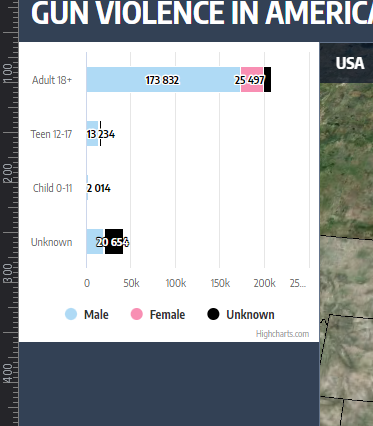
- Demographics - Column chart
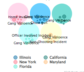
- Incident Attributes - Bar chart
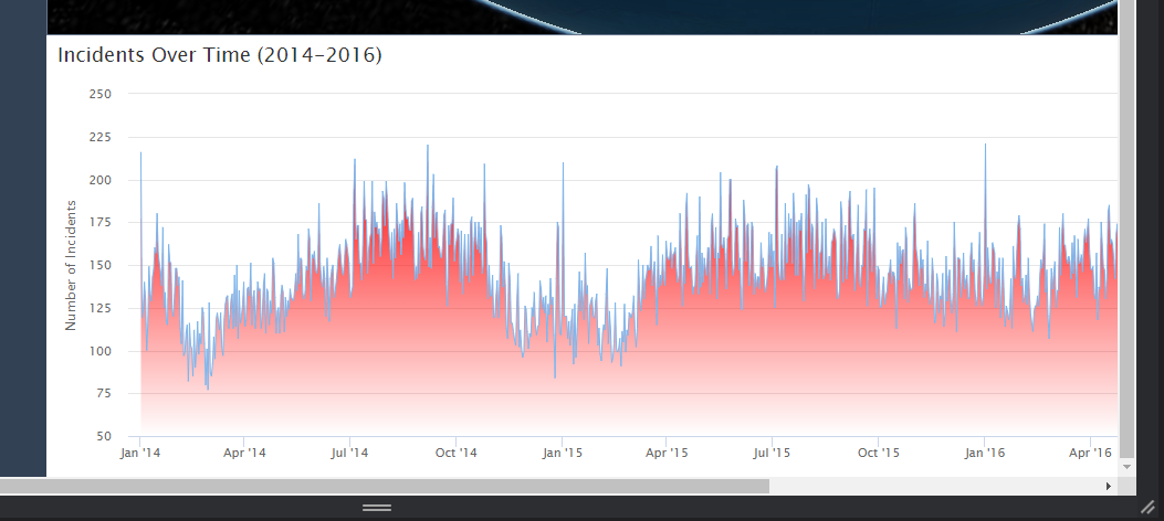
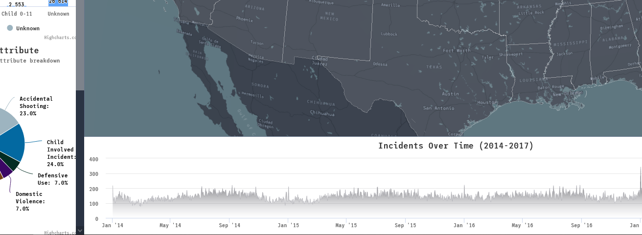
- Incidents over time - Time series graph (zoomable)
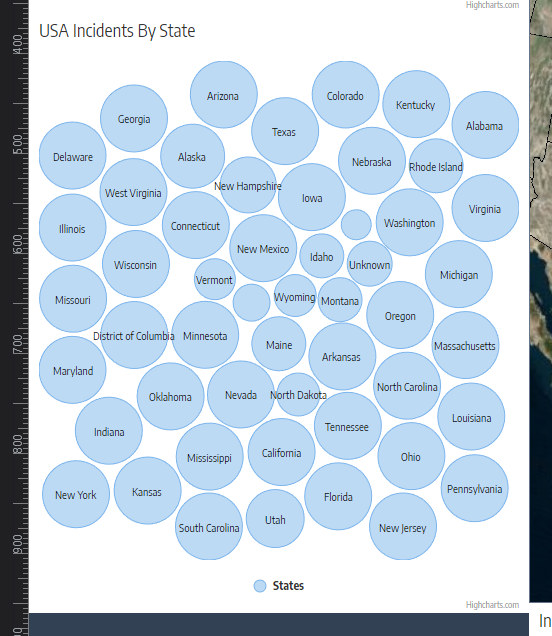
- Gun Type / Caliber - Bubble chart
Coming into this project, we had a few different suspicions about the overall trends and what the data could show us. While we expected a lot of individuals involved in shooting incidents to be mostly adult men, we were shocked to see by how much of a gap there was between adult men and the next closest. Another interesting observation was the fact that the top three days with the most amount of incidents were all January 1, New Year's Day.
Furthermore, looking at the most pertinent shooting attributes nationally, the top five categories of gun violence incidents in order were: Drug Involvement, Home invasion, Domestic Violence, Defensive Use, and Accidental Shooting. We thought that this was a noteworthy observation as this list was a far cry from the all-too common news headlines depicted by news outlets and portrayed to the public. Given how often mass shootings are mentioned and highlighted, we frankly expected a larger percentage of the incidents to account for this, but this was not the case. To add on to this, the news and politics of gun violence often revolve around the topic of assault rifles, but it seems the incidents where we do know what guns were used are largely comprised of handguns, not rifles.
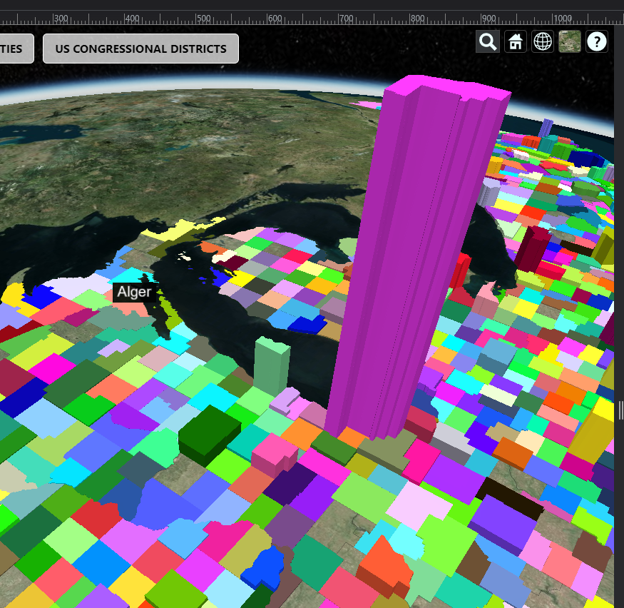
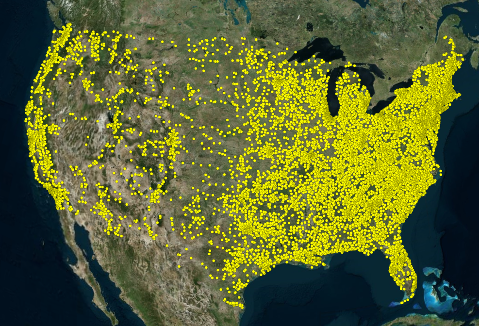
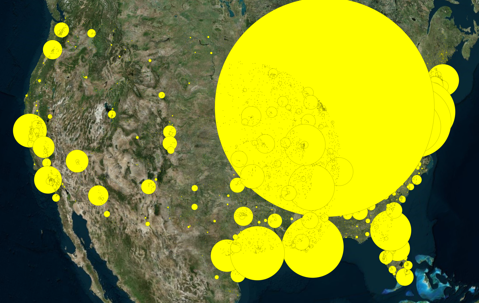
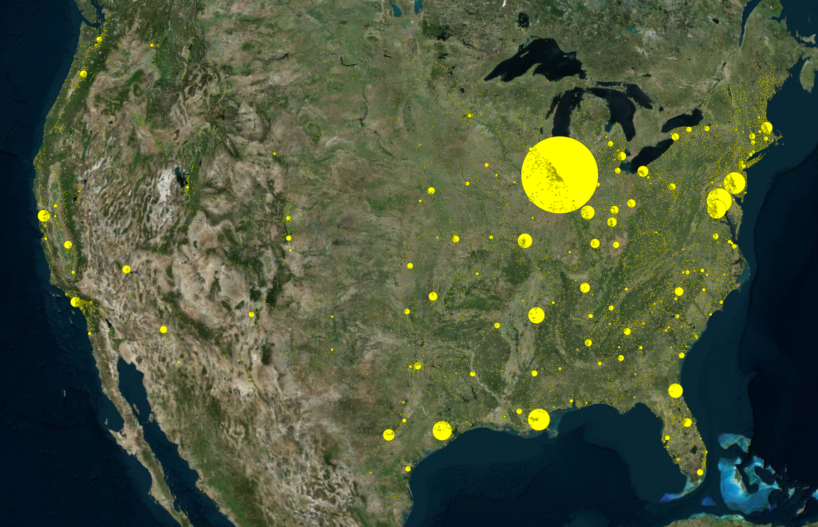
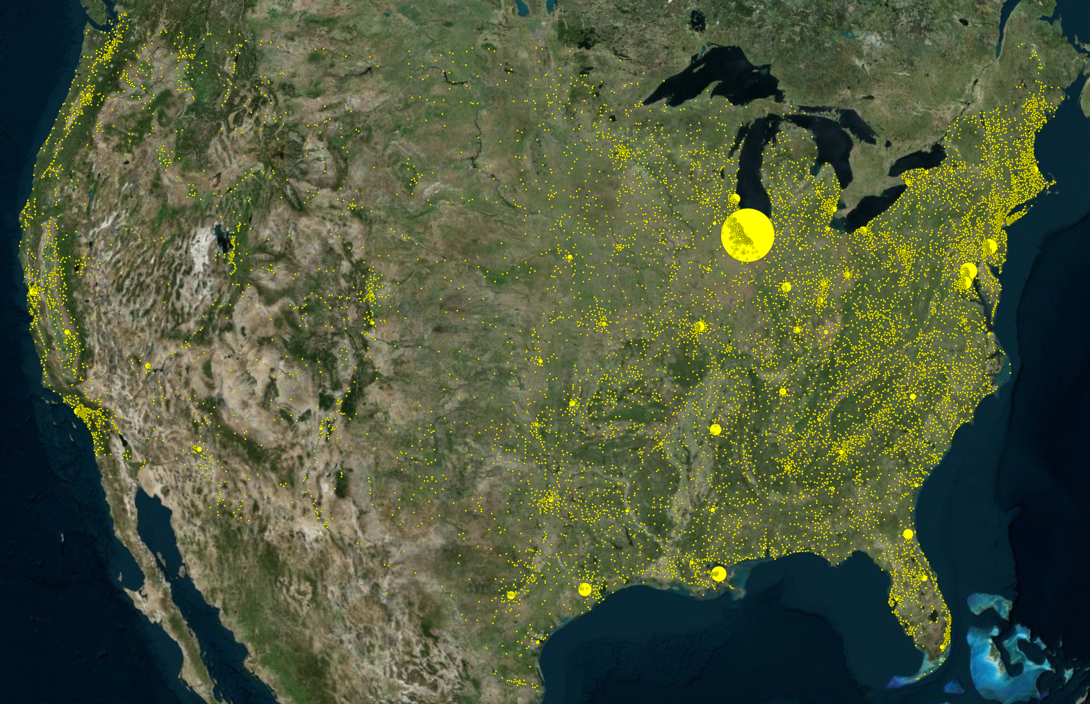
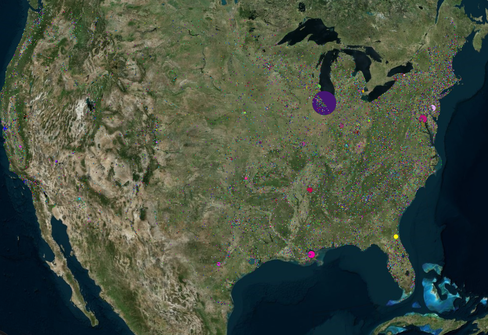
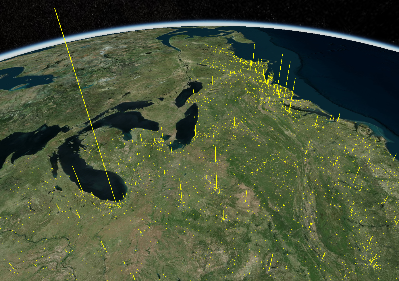
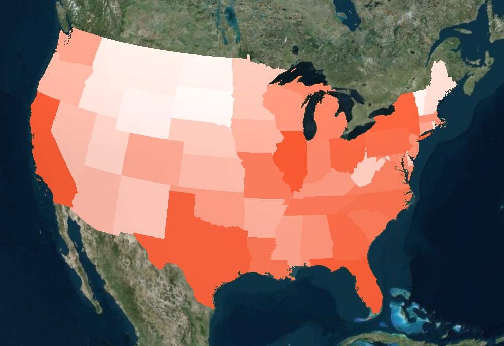
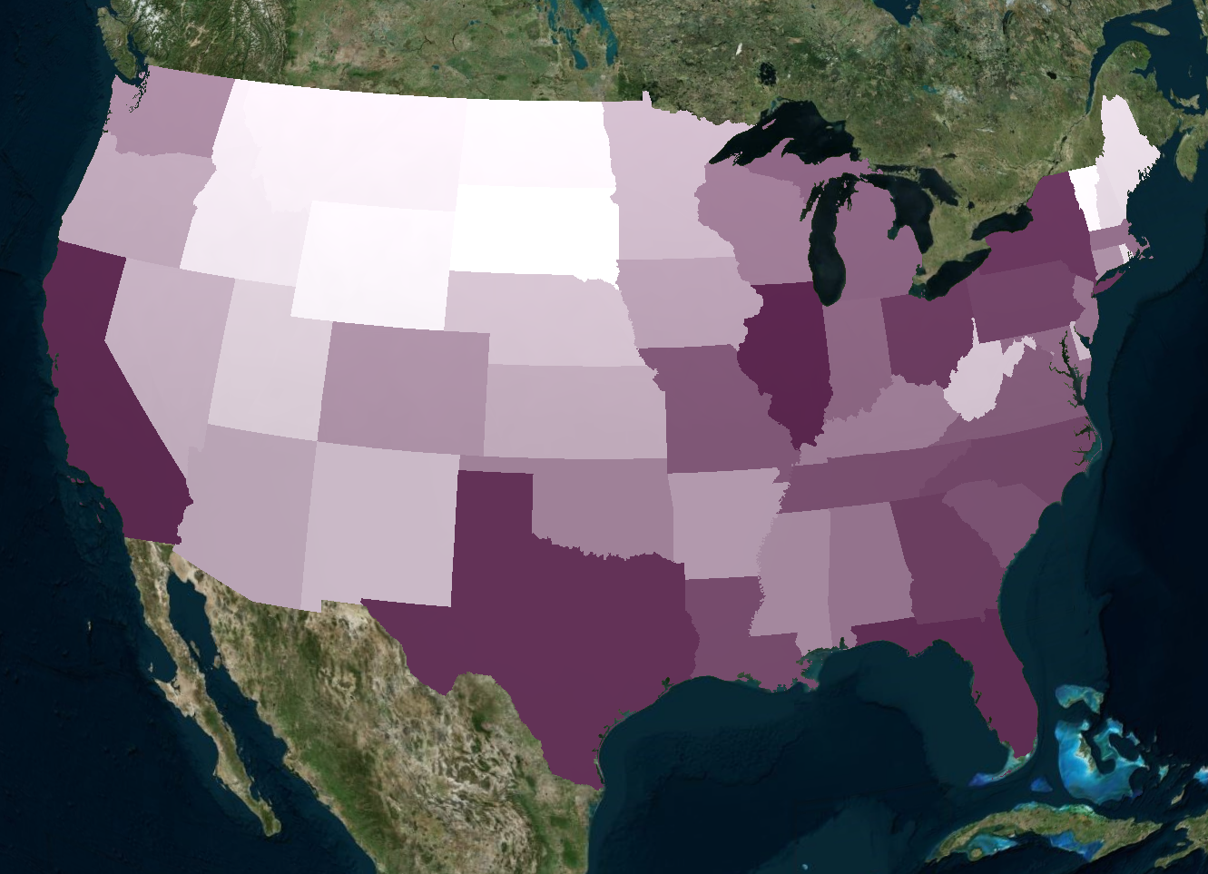
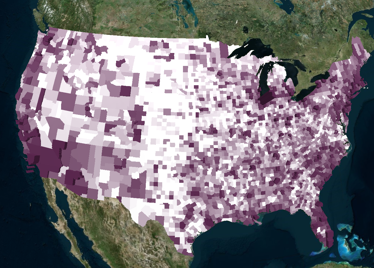
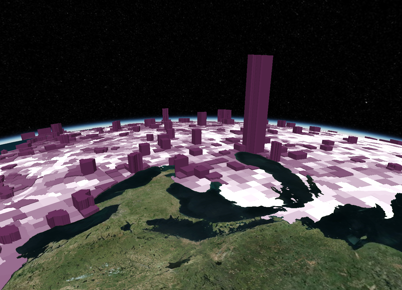
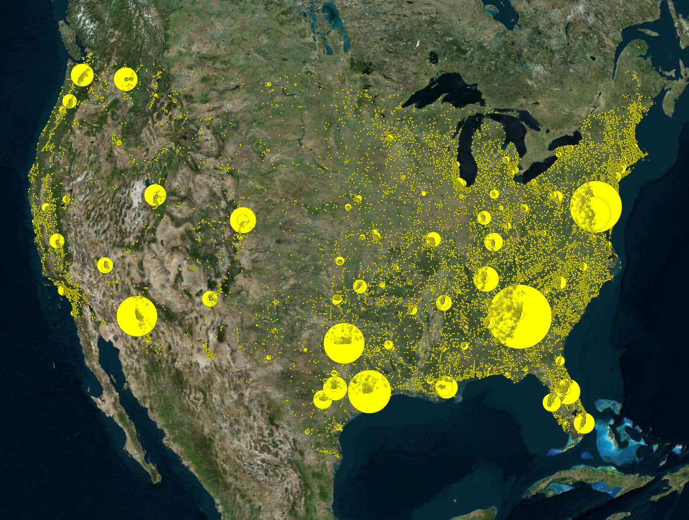
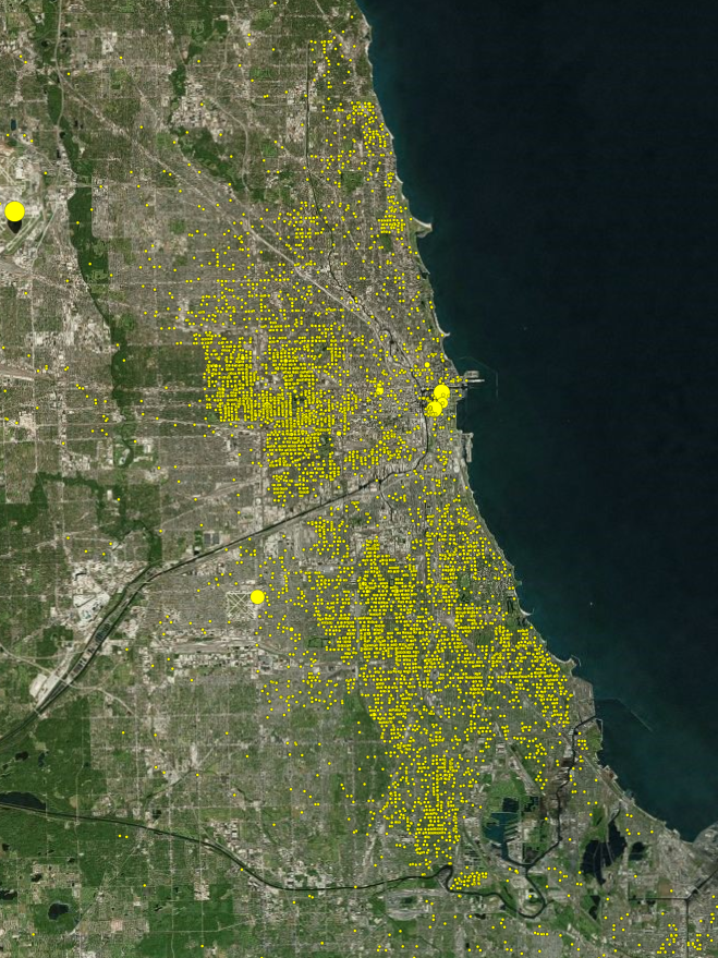
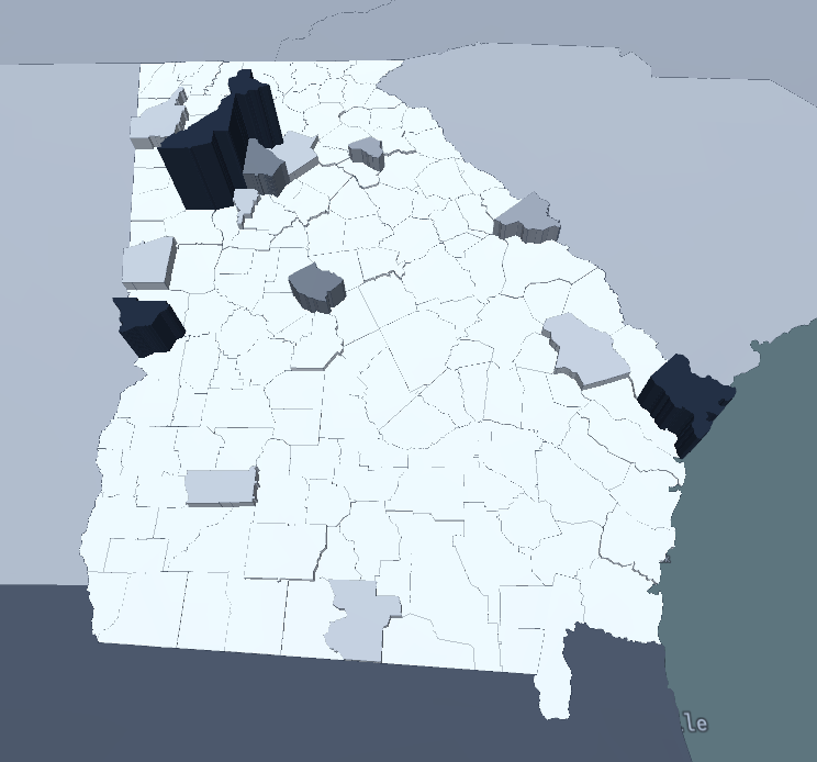
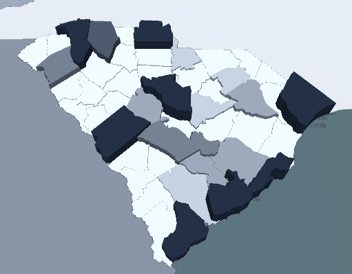
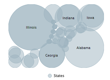
Moreover, it appears that most of the gun violence incidents are concentrated around urban areas. This also applies on a county-by-county basis with the incidents occurring in just one area where the population is most dense. This may seem like an obvious observation, but one we still noted. On the topic of urban areas, we also want mention how much of an outlier Cook County and Chicago were. Illinois as a state isn't too bad on paper when we don't look at Cook County, but when Chicago is included, it produces the single most noticeable outlier on the whole map. Cook County during the years of 2013 to 2017 was practically overrun with gun violence (mostly gang and drug related incidents) and zooming into the City of Chicago shows that there were incidents in almost every block. Even when compared to other urban centers, Chicago by far was one of the worst as far gun related violence.
Working on this project, to say the least, has been a truly eye-opening experience for us. Despite starting our research with some prior dispositions about the topic, the data set was so vast and incredibly powerful that it still provided us with insights that we wouldn't have been able to obtain otherwise. Moreover, what we also think made a major difference was the use of data visualizations. From doing something as basic as plotting points on map to dissecting the relationships between attributes, seeing data in a visual format helped us notice patterns and trends that we probably would have missed. The analysis process became much easier, more efficient, and most importantly, allowed for the discovery of the hidden insights we were after. Overall, while this project has been a technical challenge, it has taught us the importance of using data visualization techniques to bring to light undiscovered information within complex data sets, and we are excited to apply what we learned in future projects and endeavors.
- H517 - Visualization Design, Analysis, and Evaluation - Project 2
- IUPUI Human-Computer Interaction Master's Program, Spring 2023
- Caleb Likens - Website ↗
- Wilson Piguing - Website ↗
- Source Code - GitHub ↗
- About - Download ↗
- Gallery - Download ↗
- Video - Watch ↗
